Did I accept it? Yes. Why? Because I was going to use a Style and get it done in one weekend.
How does a style works and why you sould learn right now how to use them?
A Style in Android is very similar to a CSS style for your HTML; you have to define the visual properties in a file and then you can just apply those visual properties to your widgets. This is a no sweat situation where time is not in your side and there is a lot to be done.When you use a style, the visual properties will remain in the app so you don't have to remember how much padding you are using or what is the color for this and that. The style has all that things declared so you only apply the style into the views you need. Money!
Creating a basic style for Android and applying it
Let's start creating our first style. We are going to make all our EditText to look the same according to what my customer wants: "rounded but not 'cartoonish' with a slight shadow to make it look 3D and witrh blue borders". Yes, my customer said 'cartoonish'.Mi first assumption was that my customer wanted rounded corners but with a small radius. Maybe he was aware that the guideliness say that is best to avoid "curves" in your designs. "Bubble-like" buttons are not so popular right now. The seccond guess was the "background". I'ts clear what he meant, so we will use a gradient to do that. Lastly, the border will be blue.
 |
| How did I create a custom View with no Adobe skills? My XML is very sharp |
The first step is to create the overall eye-candy, the "look-and-feel" with XML using a shape.
Go to you drawable folder, right click on it and select New>Drawable resource file.
 |
| Use 'edittext_normal_shape' as the name |
First, let's make sure that the root DOM element is not <selector>, replace it by <shape>:
<?xml version="1.0" encoding="utf-8"?>
<shape xmlns:android="http://schemas.android.com/apk/res/android">

</shape>
Now, lets use a rectangle as the main shape of this image:
<?xml version="1.0" encoding="utf-8"?>
<shape xmlns:android="http://schemas.android.com/apk/res/android"
    android:shape="rectangle">

</shape>
Now we will add a gradient to make the shadow effect:
<?xml version="1.0" encoding="utf-8"?>
<shape xmlns:android="http://schemas.android.com/apk/res/android"
    android:shape="rectangle">
    <gradient
        android:startColor="#FFF"
        android:centerColor="#FFF"
        android:endColor="#F3f3f3"
        android:angle="90">
    </gradient>

</shape>
The gradient is using 3 colors. The bottom and middle color will be white, and the end color (top) will be grey so there is the shadow effect. We can define the angle of the gradient as a top-bottom color with 90 degrees.
Now lets define the rounded corners:
<?xml version="1.0" encoding="utf-8"?>
<shape xmlns:android="http://schemas.android.com/apk/res/android"
    android:shape="rectangle">
    <gradient
        android:startColor="#FFF"
        android:centerColor="#FFF"
        android:endColor="#F3f3f3"
        android:angle="90">
    </gradient>
    <corners
        android:radius="4dp">
    </corners>

</shape>
Now, the border line:
<?xml version="1.0" encoding="utf-8"?>
<shape xmlns:android="http://schemas.android.com/apk/res/android"
    android:shape="rectangle">
    <gradient
        android:startColor="#FFF"
        android:centerColor="#FFF"
        android:endColor="#F3f3f3"
        android:angle="90">
    </gradient>
    <corners
        android:radius="4dp">
    </corners>
    <stroke
        android:color="#3d85c6"
        android:width="1dp">
    </stroke>

</shape>
What is this? This is the shape that will be used as image.We are not using any ".jpg" resource. Instead we can provide a valid, well structured description using XML. Actually, you can just use this as a background image for any EditText and the result will be the same as the picture above.
Since I have only 2 weeks to get it done, I will not set the "background" property for each EditText in each layout, let's use this as our Style.
Open the Project Navigator with <Alt+1> then go to res>values>styles>styles.xml.
The Styles resource file is used to define all of your styles that will be used in your app, as long as you don't define anything there, the system will use the default look using this file with only 1 line of markup:
<resources>

    <!-- Base application theme. -->
    <style name="AppTheme" parent="Theme.AppCompat.Light.DarkActionBar">
        <!-- Customize your theme here. -->
    </style>
</resources>
The element <style> defines a style and will inherit from "Theme.AppCompat.Light.DarkActionBar" which is a main style already defined using the Android SDK. You can override most of the properties here making the "AppTheme" to look exactly how we want it.
Before we can override directly the style of the EditText using the background defined earlier, we need to create it's own style and use it to override. Since we are going to apply it to the EditText, we are inheriting from "Base.Widget.AppCompat.EditText".
Some of the names are very easy to understand. I don't know every item, but since it has "EditText" and "Widget" on it I can be 100% sure that this is an EditText.
<resources>

    <!-- Base application theme. -->
    <style name="AppTheme" parent="Theme.AppCompat.Light.DarkActionBar">
        <!-- Customize your theme here. -->
    </style>

    <style name="CustomEditText" parent="Base.Widget.AppCompat.EditText">

    </style>

</resources>
Now, our "CustomEditText" style exists. It inherits every single property from the regular EditText but we need to override the background using our shape item.
<resources>

    <!-- Base application theme. -->
    <style name="AppTheme" parent="Theme.AppCompat.Light.DarkActionBar">
        <!-- Customize your theme here. -->
    </style>

    <style name="CustomEditText" parent="Base.Widget.AppCompat.EditText">
        <item name="android:background">@drawable/edittext_normal_shape</item>
    </style>

</resources>
Our style is ready to use. From here, you can apply the style mannualy in every "style" property in each of your EditText or you can override the current style defined by the System.
<resources>
<!-- Base application theme. -->
<style name="AppTheme" parent="Theme.AppCompat.Light.DarkActionBar">
<item name="android:editTextStyle">@style/CustomEditText</item>
</style>
<style name="CustomEditText" parent="Base.Widget.AppCompat.EditText">
<item name="android:background">@drawable/edittext_normal_shape</item>
</style>
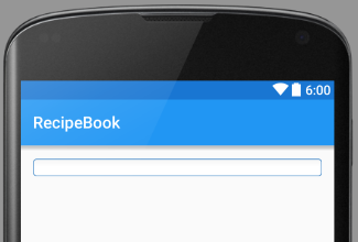
</resources>After these changes, you can navigate to any layout then drag and drop an EditText. You will see how the changes you have done to the style apply to the widget without writting a single line of code in the XML properties of the widget.
|
| This is the final result. Only XML then drag and drop |
As you can see a simple xml can define the background image of a widget but it can also define the behavior.
The client said that the buttons should be circles, they must be in a blue color when enabled and slightly bigger when pressed but gray when disabled. This means that i have to define 3 different backgrounds, one for each state for the button.
State: Default.
Like in the EditText style, i have to create a shape and define some properties to make it look like a circle.
The default state is the "normal" state. When is neither pressed and disabled.
<shape android:shape="oval" xmlns:android="http://schemas.android.com/apk/res/android">
    <size android:height="28dp" android:width="28dp">
    <solid android:color="#1C89AD">
    <stroke android:color="#91999C" android:width="2dp">
</stroke></solid></size></shape>
State: Pressed.
Now lets make the pressed state, the only difference from the default state is that its slightly bigger.
<shape xmlns:android="http://schemas.android.com/apk/res/android"
    android:shape="oval">
    <size android:height="28dp"
        android:width="28dp"/>
    <solid
        android:color="#1C89AD"/>
    <stroke
        android:color="#91999C"
        android:width="2dp"/>
</shape>
State: Disabled.
And finally let's make the disabled state.
<shape xmlns:android="http://schemas.android.com/apk/res/android"
    android:shape="oval">
    <size android:height="28dp"
        android:width="28dp"/>
    <solid
        android:color="#B6BFC2"/>
    <stroke
        android:color="#91999C"
        android:width="2dp"/>
</shape>
Now, lets create a selectable.
<?xml version="1.0" encoding="utf-8"?>
<selector xmlns:android="http://schemas.android.com/apk/res/android">
    <item android:drawable="@drawable/btn_circle_default"></item>
    <item android:state_enabled="false"
        android:drawable="@drawable/btn_circle_disabled"></item>
    <item android:state_pressed="true"
        android:drawable="@drawable/btn_circle_pressed"/>
</selector>
As you can see, the selectable declares 3 states: default, disabled and pressed. Those 3 sates will have a drawable resource and will have to change from state to state according to the drawables.
Finally, lets go back to our style layout and assign this selectable to the button.
<resources>

    <!-- Base application theme. -->
    <style name="AppTheme" parent="Theme.AppCompat.Light.DarkActionBar">
        <item name="android:editTextStyle">@style/CustomEditText</item>
    </style>

    <style name="CustomEditText" parent="Base.Widget.AppCompat.EditText">
        <item name="android:background">@drawable/edittext_normal_shape</item>
    </style>

    <style name="CustomCircleButton" parent="Base.Widget.AppCompat.Button">
        <item name="android:background">@drawable/selectable_btn_circle</item>
    </style>

</resources>
Now we have a button ready to be used with a custom style.
After creating a set of styles for my app, I still have to match text styles: Titles, subtitles, description text and link texts. The good part is that I just need to adjust some parameters because there is no need for background drawables or states.
TextView Title
I will use the same color as the button for the title on the textview and the size will be much bigger. Also, since it's a title it will be on the center.
Since I dont need a drawable for this, I can edit this directly from the style file.
<style name="CustomTitleTextView" parent="TextAppearance.AppCompat">
        <item name="android:textColor">#1C89AD</item>
        <item name="android:textSize">32sp</item>
        <item name="android:textAlignment">center</item>
    </style>
The style will be using a text color, a text size and the alignment by editing the items properly named. Using Android Studio 1.4 I can use the autocomplete to see what else I can edit.
Now I have the subtitle remaining. It will use the same color, so I can extend from the previous style
<style name="CustomSubtitleTextView" parent="CustomTitleTextView">
        <item name="android:textSize">22sp</item>
        <item name="android:textAlignment">left</item>
    </style>
As you can see, I'm extending the style from the previous text so the color is inherited but im overriding the text size and aligning it to left.
Apply the styles
Once you have the styles ready, you can set them in the layout editor. Navigate to a layout and lets add a button.When the widget is created, you can select from the properties pallete the field "style".

With the "style" selected, press <Shift+Enter> and select the "Project" tab from the resources window. Scroll down to find your custom theme and select it. You can see in the preview the style definition. Click "Ok" to apply it.

Once it's completed, you will be able to see the changes in the style right in the layout preview.
 |
| This is a button with a custom style |
Apply to all widgets.
Back to the story, I was very lucky to see that all widgets had the same style and I was able to override the Android default style with my own instead of setting the style for each widget every time I use one.
From the styles xml, I can just apply the item "style" to the widget, like the following example:
 <!-- Base application theme. -->
    <style name="AppTheme" parent="Theme.AppCompat.Light.DarkActionBar">
        <item name="android:buttonStyle">@style/cutsomButtonStyle</item>
    </style>
Once done, you can just drag an drop a button (in this case) and it will inherit the style from the styles value.
So as you can se, it took some time to write all of the styles but in the end I did an awesome job. My customer was not just happy but he actually was amazed that I was able to do all of the work in such a reduced gap of time.
Thank you for reading!
great, thanks
ReplyDelete