The Theme Editor allows you to set up the look and feel of the entire app. The theme will dictate the rules of the look of many widgets like Buttons and Text Views. It can also provide the color setup for tabs, selections, backgrounds and much more and save a lot of coding time.
Why you should define a theme?
Well, a theme will help you to use widgets and styles that match your app context. Instead of setting attributes for every widget and screen, you can define a style by default and focus on the model of the app. So let's not waste time and lets get our hands dirty.
1. Opening the Theme Editor
Press <Ctrl+Shift+A> to open the Action Search Bar, then type "Theme Editor". You will be able to pick the Theme Editor Action.

The theme editor will let you see how will the default theme will behave on every SDK. As you can see, the default theme styles are running in my app but we are going to define a theme of our own.

You can see how the default theme will behave by selecting an API level on the top menu of the Theme Editor. See how it changes when it switch from 23 to 10. (If you can't see other API options download the API from the Android SDK Manager).

2. Create a new Theme
Let's start by selecting the pop up menu from "Theme" and selecting "Create new Theme" and add "myNewTheme" as the name.

As you can see the new theme will inherit all the styles from the "AppTheme". Now let's add some changes so our theme looks unique.
Primary Color:
It's the main color of your app. It should be the most important color and identity of your app but it's not supposed to be the same as the background.
When you click on the pop up menu, a "Color picker" will be shown. Pick a color then click "Ok". As you can see, all of the widgets will update to match (if so) the color now playing in the theme.

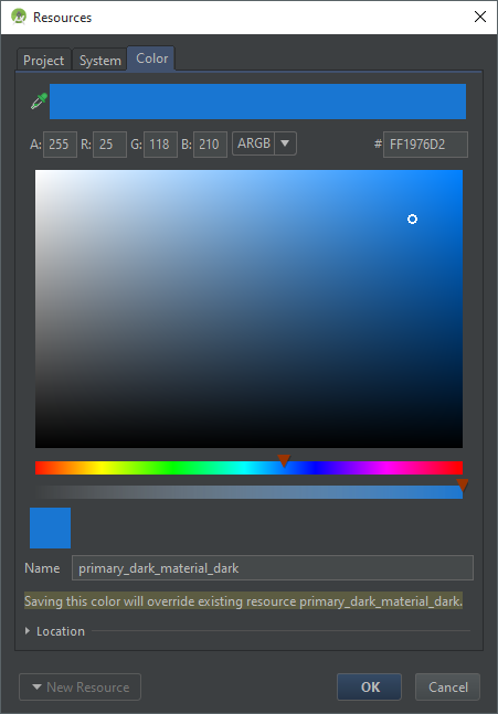
Color Primary Dark
It's the color in the Android Bar. The Android bar will hold the status of the phone outside the app. Like battery and Wi-Fi signal. Also the clock. Usually the Color Primary Dark matches the Color Primary.
When you select the pop up menu for this field, there will be a color already pre-selected (The Primary Dark). All your colors seleected from the mixer will be added there so you can pick them faster.
If you are working with the api 23, the background text color will adjust from black to white to match the contrast and make ir more "readable". Pretty cool.
Color accent.
It's the color that will be used in most of the features like the progress bar, checkboxes, and radio buttons. Try to match the primary color but don't make it the same.
Color Foreground
According with the official documentation it will be used for displaying the background for imagery. This means that the background of an image will be that color so make sure you match it with the background color.
Navigation Bar
Will set the color of the bottom bar. The LolliPop Api allows you to paint that bar but with lower versions it will have no effect.
The usual GUI suggest that you paint it the same color as the color primary dark.
Text Color primary
When you try to edit this style, Android Studio will warn you about something werid: "@android:color/primary_text_default_material_light is a private Android resource". Ok... Whetever that means...

Basically it says that we cannot override that style so we have to define a new style for this. Click on the first element on the list and select a color. Then change the name of the "Name" to "my_text_color" so you create a unique color.
 |
| Use <my_text_color> in this case |
As you can see, there is no longer a "disabled" state or at least, the disabled state now it's in the same color of the enabled and this is a huge mistake un our UI design. All of the text is behaving the same way. Did we break something?
Well yes and no. The text we had previously defined was taking some attributes from different states: A default (or enabled) state, and a disabled state. So we are going to do the same; we need to create a text that can respond to disabled, enabled states.
Click again in the Text Color field and move to "Project" tab. Select "New Resource" and select "New color File".

In the menu, use "my_text_style" as the file name and leave everything for default then click ok.
You will have to define your 2 states from the selector from the XML text editor. Lets start with the default state. As you can see I'm using the system color pallete then, I define the default state.
The resulting XML code will be like this one:
<?xml version="1.0" encoding="utf-8"?><selector xmlns:android="http://schemas.android.com/apk/res/android"> <item android:state_enabled="false" android:color="@color/secondary_text_disabled_material_light"/> <item android:color="@color/my_text_color"/></selector>
If you did everything right and if im actually explaining this like it's supposed, you will now see that in the preview thet text has a color for your enabled display and a different one for the disabled.
The Text color primary inverse will replace your current text color when the configuration of the theme changes for a dark theme. Just do the same for the previous step but remember now that the background will be black, so choose a brighter color.
Text color secondary
That will be used for the medium and small text colores. You can change it the same way we have been changing text colors and also for the inverse.
Background.
The window background will have this color. I'm not going to change it because i like how it looks now but let me explain a cool feature this thing has. Click on it and move to "Project". You can choose an image here instead of just a plain color. How cool is that?
At the end of the tutorial this is the result of my theme:

Once you have completed your changes you can just close the editor and all of the changes will be applied in your Layout Editor. Can you say "eye candy"?
There is a lot of room for learning and use of this tool. I can't wait to see how much can be accomplished using it but I won't spoil your fun.
Try it now!
Thank you for reading.
No comments:
Post a Comment